Tampilkan postingan dengan label breastfeeding. Tampilkan semua postingan

Kamis, 10 Mei 2012

Time cover features preschooler breastfeeding

Via BuzzFeed

So that was unexpected.

As the United States continues to struggle with the social and health issues around breastfeeding, Time Magazine decides to run a cover photo of a nursing three-year-old.

It's for a piece on attachment parenting, which we practice to some extent at our house (even though the boy weaned himself at about 20 months). I'm sure the picture is meant to shock some people who think breastfeeding a kid old enough to talk is weird or even perverse.

"Supermom" Jamie Lynne Grumet (the woman in the picture) told Huffington Post:

“When you think of breast-feeding, you think of mothers holding their children, which was impossible with some of these older kids. I liked the idea of having the kids standing up to underline the point that this was an uncommon situation.”

But hey — in the struggle to normalize natural baby feeding, such a prominent portrayal can only help.

My only question is, now that breastfeeding is considered "SFW" enough for the cover of Time, can Facebook stop calling it "obscene"?


See more photos from the shoot here.

Jumat, 20 April 2012

Louisville's bizarre breastfeeding ad is not helping the cause #FdAdFriday


Great. Many Americans are already weirded out by breastfeeding because they see breasts as single-function male titillators. But with this completely effed take on the unfortunate and played out "animated talking baby" format, they're just creeping people out even more.


Worst of all is the sped-up baby voice. It reminds me of "that high squeaky voice" of evil Toon in Who Framed Roger Rabbit. Not a good association.

The campaign means well, at least. In the United States, women of African ancestry have some of the lowest breastfeeding rates. It's an issue that needs addressing. But is the the best the mayor's Healthy Hometown initiative could come up with?

If you read this blog, you know how I feel about the issue. Breastfeeding is a marvellous and deeply human thing. This ad... is not.

Via Adfreak

Rabu, 18 April 2012

A much more clever cynical exploitation of breastfeeding to move product

That Oreo ad I posted last night is probably spec anyway, but on Ads of The World's (uncensored) Google+ posting of the campaign, Stefaan Galle shared this much more clever ad:


He describes it as an ad for online data back-up that reads, "Because nature also provides a backup."

Heh.

Selasa, 17 April 2012

Oreos and breastmilk? At least one is good for baby (but not for Facebook)

"A representative from Kraft Foods reached out to HuffPost Food to clarify the origins of this ad. The ad was created by Kraft's ad agency, Cheil Worldwide, for a one-time use at an advertising forum and was not intended for public distribution or use with consumers."
Hmmmm...


It's a cute ad, even if it's using something sacred to sell cookies.

But here's the real story: When my friend Ivan, from Ads of The World, posted it on Facebook, he felt compelled to censor the image:


Why? I can't blame him. He was just protecting his social presence, because Facebook is notorious for censoring breastfeeding pictures.

It's like Facebook gets kickback from Enfamil.

And they ban people who don't follow the rules. Even mighty FEMEN have acquiesced and censored their "weapons" of protest.

Now, this example is not so virtuous. But it's interesting that Facebook has made everyone afraid of posting breasts, even in their least sexual context. And how perverted is that?

Rabu, 07 Maret 2012

Creating an international symbol for homebirth

Emma Kwasnica, the now-famous breastfeeding activist, shared this interesting link on Facebook.

Apparently, the Peaceful Parenting blog has been trying to crowdsource a symbol that homebirth advocates and organizations could use as an identifier. It's a good idea, since causes need symbols just like nations need flags.

A good bar has been set, both in similar cause and public acceptance, by the "you're welcome to breastfeed here" signs that are now common.


Here is an explanation of how they are doing it:
"The finalists for the International Homebirth Symbol have been chosen by a panel of birth and babies professionals and mothers alike (see panel members here). They are presented here for your vote. Graphics are drafts and may be brushed up or altered slightly for finalization. Color/shade will also be voted on publicly once the symbol is selected. All are presented here in the same shade for voting purposes only. Artists will remain anonymous to the panel and public until voting is complete. The top symbols will go on to Round Three where they will be voted on by a panel of graphic design artists."
I like that they are putting these forward as abstract symbols, without consideration for colour or perfection of execution.

In situations like these, I try to ask myself WWPAD? (What Would Paul Arthur Do?). The sadly-missed godfather of pictograms, signage and wayfinding could have really helped these folks. I briefly knew the man,  who famously decided it was a good idea to use symbols instead of "men" and "women" at Expo 67 — something we cannot today imagine a world without. (He was my S-I-L Laura's stepfather.) But since he died when I was just starting to enter the fullness of my creative career, I never got to work with him professionally. Instead, I am inspired by skimming his books and reading others' memories, like this frank critique of proposed icons for the "World Wide Web."

I am no designer — and certainly no Paul. But I would like to bring this interesting exercise to the attention of my fellow professionals.

Here are the entries:

A: I get it, but it has an unfortunate resemblance to the internet shock meme goatse man.
(If you don't know what that is, you're lucky. Here's the Wikipedia link.

B: Sweet, but says "healthy pregnancy" more than "birth" to me.

C: The addition of the partner is nice, but not inclusive.
Single women and gay women also homebirth, an the supporter is not always a partner.

D: Not bad. I like the "yoga" look and the simplicity.
I only wish the house icon were simpler.

E: Too abstract for me. Pretty sure this would fail comprehension tests.

F: A literal attempt to say "home birth". Kind of confusing.
I also associate realistic foetus silhouettes with anti-abortion causes.

G: A nice thought, but overly simplistic.
The heart as mother and child has been done before, and does not necessarily
communicate "birth".

H: As with others, this shows motherhood but could be post-partum at home.

I: Getting closer, but the shapes might not be 100% clear.

J: The "woman birthing" icon is clearer, but looks a little nuclear.
The lines in the house are superfluous.

K: The human idea is communicated well, and the style could easily be simplified.
Not sure if the window is intuitive enough (would need to be tested) but it's nice to
see something other than the obvious house icon.

L: Overly abstract, like G, but with more of a "birthing" feel.

M: An attempt to make pictograms out of "H" and "B".
Besides being really abstract, it is language exclusive,
and not international.

N: Like the breastfeeding symbol, but with umbilical cord and house added.
Might lead to confusion with the BF symbol, and cord might be too subtle
to communicate the moment of birth.

O: This says "loving nuclear family" to me, not birth.
Also has the same heteronormative issue as C.

P: A "primitive" (petroglyph-inspired) symbol that says "motherhood"
more than anything. No implication of "birth" and "home".
And no, folks, I am not being too mean. I am actually being very gentle, in Creative Director trms, because I know that these are earnest efforts by people from a variety of backgrounds.

But that's the whole problem here. Functional design, such as this, should never be croudsourced or contested. It should be developed by specialized professionals, and tested extensively in controlled market research, to make sure it is understood.

The opinions I gave above are just first reactions — the kind of advice I would give to designers at an initial creative review, to help them refine their ideas and avoid wasting time on non-starters (like M).

Since Peaceful Parenting have already committed to this selection process, they can't stop now. But if they want to stand any chance of having the result widely adopted as a recognized symbol of homebirth, I hope they will turn the results over to professionals for final design, testing, and change if needed.

Trust me, it's the right thing to do. Because when symbolic logos fail, they fail hard.

Senin, 16 Januari 2012

What the hell is in this baby formula?


Copy says, "New! A natural solution that keeps your facial skin revitalized. A better sleep for your baby with Materna's Good Night infant formula."

Does it have Benadryl in it? Gravol? Morphine? According to this source, the secret ingredient is "special composition of carbohydrates, giving the baby a longer feeling of fullness."


What a terrible idea. Babies wake up and cry because they aren't really supposed to be left alone. (Think about it — in a state of nature, they'd be eaten by wolves.)

I understand that not everyone can or wants to breastfeed or cosleep. But an ad promoting a formula that keeps your inconvenient baby quiet so you can get your beauty sleep really irks me. It's playing to selfishness and vanity.

By JWT, Tel Aviv, Israel

Via Ads of The World

Rabu, 04 Januari 2012

Bring the boobs back to Sesame Street

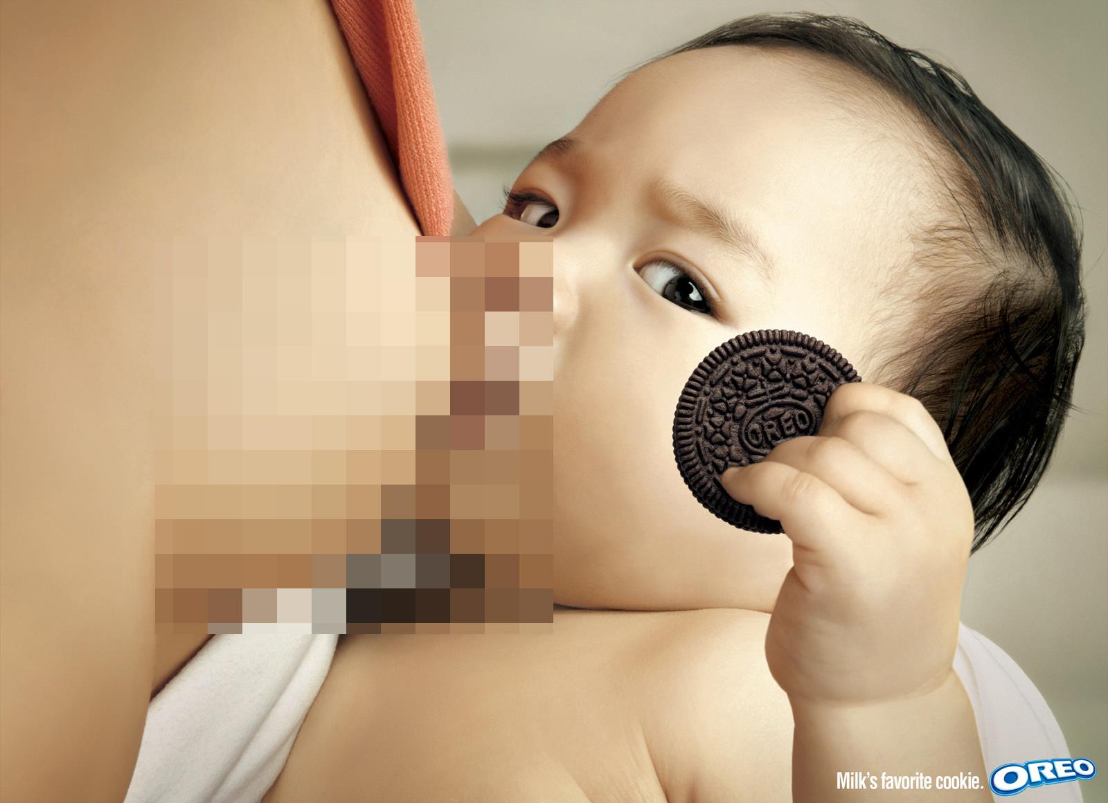
No, I'm not talking about that Katy Perry fiasco a couple of years back. This is something altogether more innocent: breastfeeding.

Back in the '70s and '80s, Sesame Street included breast feeding promotion as part of its educational mandate to American kids.

Here's Canada's own Buffy Sainte-Marie doing it with her son Dakota "Cody" Starblanket Wolfchild in 1977:


And here's the character Maria (played by Sonia Manzano) nursing her real-life daughter, Gabriela, in 1988:


It's practically the same scene. But something happened on Sesame Street, as it grew out of its baby boomer roots and started becoming a corporate merchandising goliath. Breastfeeding somehow became something inappropriate for a kids' show.

The most damning piece of censorship is a touching musical segment called "You're My Baby".

In the original '70s version, the camera lingers on a nurseling:


Twenty-plus years later, when it was remade for a new generation of kids, the breast was replaced:


While certainly reflecting the reality, for many America parents (especially moms with very limited maternity leave!) the very deliberate substitution irked breastfeeding advocates such as Lani of the Boobie Time blog, who has started a petition to try to convince Sesame Street to promote breastfeeding again.

Why is this a big deal? Back in the earlier days, the show was actively promoting a behaviour that was in the interest of American babies. Breastfeeding rates were going up overall, but the increases were mostly accounted for by affluent "white" women. Rates among Hispanic and African Americans remained low. Sesame Street, the great social leveller, was doing its part to normalize the practice among all its viewing families — it was one of the show's many embedded bits of social marketing.

Zoom forward to the present, and American women continue to experience anti-breastfeeding sentiment, in public places, despite many legal protections. To put it bluntly, there are many who consider breasts to be sex-only organs, and who consider their public exposure in breastfeeding to be obscene.

In the latter "you're my baby" video, Sesame Street may have been reacting to the way many of its viewers really feed their babies — being descriptive rather than prescriptive. After all, the revolutionary show has focus groups and organized "decency" mobs to worry about now.

But can't they take a leadership position again? To model a better world than the one some viewers find themselves in?

I'd love to hear your thoughts.

Thanks to my sister, Mary Jo, for sharing this story with me.